The use of text in WALLPAPER’s gameworld
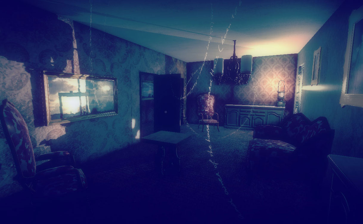
In our last collaborative work, Nightingale’s Playground, which is comprised of four very different parts, we experimented with text in a three dimensional environment, allowing paragraphs from the story to ‘hang in the air’ and sentences to curl and weave like cobwebs around a claustrophobic house interior. We’ve always been keen to return to this idea – but to push it much further; WALLPAPER will allow us do exactly that, although the story behind WALLPAPER is very different to that of Nightingale’s.
WALLPAPER sees the main character PJ Sanders return to his family home following the death of his elderly mother. The reader/player takes the role of PJ as he arrives at the remote property, unfastens the boot of his hire car, pulls out a mysterious red briefcase, and heads into the house. His agenda is to close the place down and sell it – but he also has another task to do, involving the investigation of a locked room that he was never allowed to enter as a child.
Like wallpaper itself, this is a multi-layered work in terms of both media and narrative. PJ’s childhood memories and family history return to him in a medley of thoughts as he explores the house, examining furniture and objects draped in evocative personal recollection. Although parts of the story are told through very clear, almost subtitle-like paragraphs of two dimensional text, a large amount of it is as truly three-dimensional as any of the other elements of the WALLPAPER world.
As PJ moves through the house, we’re looking at developing ways in which the text can fade into existence, often with accompanying spoken word audio (whispers, echoes) before fading away again. Some of this text is presented as hand-written, circular, rotating and/or increasing in size with gentle motion. The results so far are fascinating and rather dream-like. The narrative is, in places, difficult or impossible to read in its entirety, but rather offers ‘glimpses’ of PJ’s thoughts and recollections.
As Edward Picot notes in his review of Nightingale’s Playground on Furtherfield’s website, Dreaming Methods has ‘always been at pains not to place text in front of images, or beneath them or to one side, like labels on tanks at the zoo or explanatory plaques next to pictures in a gallery… we have to explore to read. This avoids the danger of us regarding the texts as more important than the images. It pulls us in, and it makes [the] work inherently immersive and interactive.”
